Retail · Self-service · 2025–2026

Reimagining returns as a fast, intuitive self-service experience.

★Part of the Walmart MAD Award–winning Returns experience
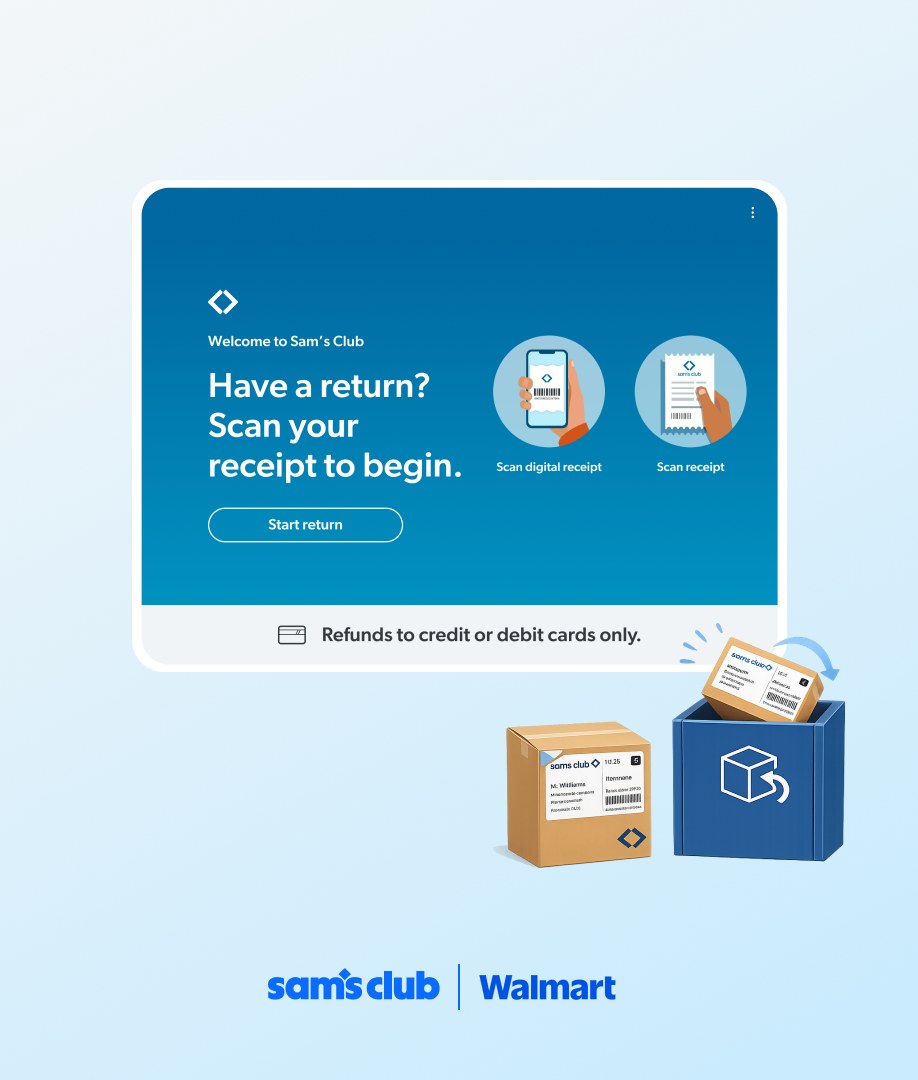
Sam's Club returns kiosk start screen reading “Have a return? Scan your receipt to begin,” beside a labeled return box and a drop-off bin
Project
Sam's Club Kiosk Returns
Role
Lead Product Designer
Team
PM, engineering, UX research, store operations, Clubhouse design & research, design technologist
Location
San Francisco & Bentonville
01

Context

At Sam's Club, every return needed an associate. Members lined up at Member Services while an associate identified them, found the purchase, validated the return and processed the refund by hand.

It worked the same way for every return, however simple.

02

The problem

Simple returns were treated like complex ones. Members waited for help they often didn't need, while associates spent valuable time on routine transactions instead of the moments where their expertise mattered.

The opportunity: shift simple returns to self-service, and save associate expertise for the returns that truly need it.

03

The solution

A self-service returns kiosk that lets members complete eligible returns on their own, with no waiting for an associate.

32%adoption across eligible returns
98%+of kiosk returns completed in under 1 minute
What it delivered
  • Reduced pressure on the Member Services desk during peak periods
  • Validated that members are willing to complete returns independently
  • Generated operational insights that shaped the future returns strategy
04

Research & insights

Understanding where self-service could actually work. We paired in-club interviews with associates and a survey of members and non-members to learn how people navigated returns, where policy created uncertainty, and which moments still needed human judgment.

The interviews covered five associates who handled returns across two clubs. The survey reached 500 people who had made at least one return in the previous 12 months.

  • 500survey respondents
  • 5associates interviewed
  • 2clubs
  1. 01

    The real friction was ambiguity, not the transaction

    Associates rarely referenced the written return policy. They relied on experience, managers, other associates and whatever appeared on their register, which led to inconsistent decisions from one return to the next.

    Design implicationThe kiosk couldn't rely on members interpreting policy. The system had to determine eligibility.

  2. 02

    Simple returns and exceptions needed different paths

    Gift returns, missing purchase history, prohibited items and higher-value purchases were where associates most often needed judgment or a manager.

    Design implicationAutomate the predictable. Route ambiguity and exceptions to an associate.

  3. 03

    Members needed clarity before committing

    Return requirements were a major source of confusion. What members most wanted to know up front was time limits, fees and item exceptions.

    Design implicationSurface eligibility and exceptions early, so members know right away whether self-service will work for their return.

  4. 04

    One queue was serving fundamentally different needs

    A member making a straightforward return waited in the same line as someone who needed complex membership support.

    Design implicationDon't optimize the queue. Give simple returns a way around it.

    From in-club observation

05

Defining eligible

The goal wasn't to automate every return. It was to automate the right ones. The research drew a clear boundary between returns a system can decide and returns that need a person.

Predictable return→ Kiosk
  • Purchase identified
  • Eligibility confirmed
  • No policy exception
  • No judgment required
Complex return→ Associate
  • Purchase can't be identified
  • Gift return
  • Prohibited or non-returnable item
  • Policy exception
  • Manager judgment required

Associates specifically named gift returns and purchases missing from membership history as cases that needed workarounds or a manager. Managers were often brought in for items over $100.

06

How it works

One return journey, designed across digital and physical touchpoints. The experience didn't end at the screen. I designed the digital return flow alongside the physical service, from kiosk interactions and printed labels to signage, packaging, disposal and the final drop-off.

  1. 01

    Identify the purchase

    Scan. Find. Select.

    Members start by scanning their membership card or receipt barcode. The kiosk surfaces items from the purchase, and ineligible items are clearly disabled.

    Members pick what they want to return, with clear quantity feedback like “1 of 5 selected.”

    Design focusMake eligibility immediately understandable instead of asking members to interpret return-policy rules.

    Scan & selectKiosk screen · item list with disabled items
  2. 02

    Tell us about the return

    A few questions, only when needed.

    For each selected item, members answer a short set of questions, such as whether it was used, the quantity, and why they're returning it. The questions repeat only for items that need more information.

    Design focusCollect what Operations needs without making a simple return feel like a form.

    Return questionsKiosk screen · per-item questions
  3. 03

    Confirm the refund

    Know where your money is going.

    Before completing the return, members review their items and confirm the payment method their refund goes to.

    Design focusCreate confidence at the moment members care about most: the refund.

    Refund reviewKiosk screen · items + payment method
  4. 04

    Print, label & sort

    The digital journey becomes physical.

    The kiosk prints a return label and walks members through each item:

    1. Print label
    2. Attach to item
    3. Find assigned bin
    4. Drop

    Each label names its destination, Bin A or Bin B, so members never have to work out where an item belongs.

    Design focusMake the handoff from screen to item to physical space almost impossible to get wrong.

    Label & instructionsPrinted label + kiosk instruction screen
  5. 05

    Drop & go

    No associate handoff required.

    Members place each labeled item in its assigned bin, confirm they're done, and leave. A digital receipt is emailed automatically.

    Return complete.

    Drop-offPhoto of bins, or confirmation screen
07

Designing beyond the screen

Self-service only works when the physical environment is as intuitive as the interface. Alongside the digital experience, I iterated on the physical return ecosystem, testing bin sizes and configurations, placement and signage, label and packaging needs, and disposal options for spoiled items.

The full journey around the kiosk
Kiosk placement
Could members discover it easily?
Signage
Could they tell what the station was for from a distance?
Bin configuration
What size and number of bins supported real return volume?
Labels
Could members confidently match an item to its destination?
Packaging
What happens when an item needs to be contained before drop-off?
Spoiled items
Where should items go that shouldn't enter the normal return stream?
Disposal
How do we keep trash out of the return bins?
Self-service return station A schematic of the return station: overhead signage, the kiosk with a label printer, a packaging shelf, Bin A, Bin B and a disposal bin, left to right. Self-service returns A B Kiosk Label printer Packaging Bin A Bin B Disposal
The return station as one system: signage, kiosk and printer, packaging, two destination bins and disposal. [Swap in a photo of the real station if you have one.]

The challenge wasn't simply designing a faster return flow. It was orchestrating the screen, label, item, signage, bins and physical space into one self-explanatory system.

08

Pilot & iteration

Testing in a real club before scaling. The initial pilot launched at a single club, where observational research with 40 members uncovered key usability and operational challenges.

  1. FY25 · Q4

    Pilot test

    Launched at one club. Observed 40 members using the kiosk.

  2. FY26 · Early Q1

    Pilot revisions launch

    Shipped fixes for the usability and operational issues found in the pilot.

What we found → what we changed
17+ of 40 members struggled to scan their receipt, the single biggest issue in the pilot.

01Getting started

  • Glare, poor receipt visibility and unclear placement made scanning fail; members went looking for a handheld scannerAdded a handheld scanner
  • Members expected to start with their membership card, not a receiptAdded membership card scanning
  • Members weren't sure the kiosk recognized themGreeted them by name with a clear next step

02Moving through the flow

  • The kiosk looked idle while waiting on backend callsAdded progress indicators and status updates
  • Members hunted through long item listsScanned item shown first; items grouped as Eligible, Not eligible, Already returned
  • Choosing an item's condition felt risky for the refundOne decision at a time, plus “Don't worry, this won't impact your refund.”

03Dropping off

  • Members were unsure which bin to use, and some items belonged in the trashClearer label and bin instructions, including when an item goes in the trash
PilotThe first scrappy setup in the club · 4:5
RevisedHand scanner, clearer labels and defined bins · 4:5
09

Reflection & next steps

  1. Scrappy first, then right

    We traded completeness for speed: the first pilot shipped without a handheld scanner. Watching members in the club showed exactly what to fix, and the revision added the scanner, improved the labels, clearly defined the bins and made the instructions easy to follow.

  2. The prototype did the aligning

    A working prototype got stakeholders aligned on design decisions and helped engineers see the experience. Animations communicated the timing, transitions and micro-interactions that mattered for implementation.

10

What I'd build next

Start the return at home. The next step is turning the pilot into a real product, and the biggest opportunity is moving the decisions out of the club. Members would pick items, answer questions and confirm their refund in the app, then just scan a code at the kiosk, label and drop.

Today
  1. Scan
  2. Select
  3. Answer
  4. Refund
  5. Label
  6. Drop
Next
  1. Select
  2. Answer
  3. Refund
  4. Scan code
  5. Label
  6. Drop
At home, in the appAt the kiosk
  • A shorter, simpler visit: scan, label, drop
  • No pressure choosing items or condition while standing at a kiosk
  • Members know their refund before they leave home

“Automate the predictable. Save people for the moments that need them.”

Want the full walkthrough?

Some of this work is confidential. Send me an email and I'll share the full walkthrough.

Send an email ↗
Next case study

Who says returns can only happen at a kiosk?

I spearheaded curbside returns, built with what we already had. And it worked.

Curbside Returns